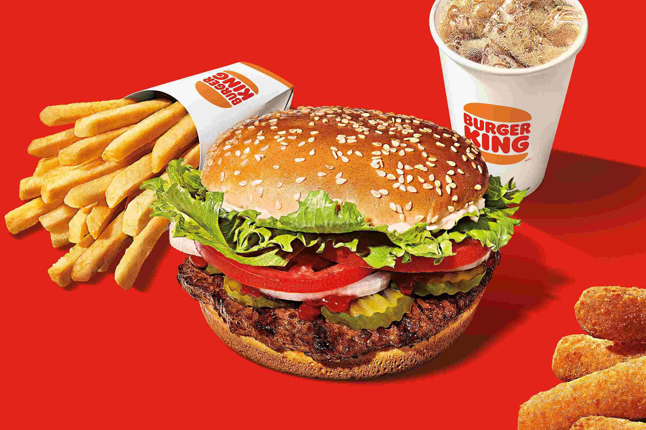

Burger King Ordering Flow
The Home page of the Burger King app serves as the pivotal entry point for the ordering funnel and reordering process for returning customers. Its design and functionality are crucial for capturing user attention, facilitating seamless order placement, and providing a quick, intuitive reordering experience. By optimizing this central touchpoint, I aim to enhance user satisfaction and streamline the overall ordering journey.
Role
Product Design ✦ User Research
Problem
The Home page of the Burger King app was cluttered with too many options, making it difficult for users to start their orders. Additionally, there was no easy way to reorder. Once an order was placed, the order confirmation lacked clarity, making it hard for users to understand the next steps.
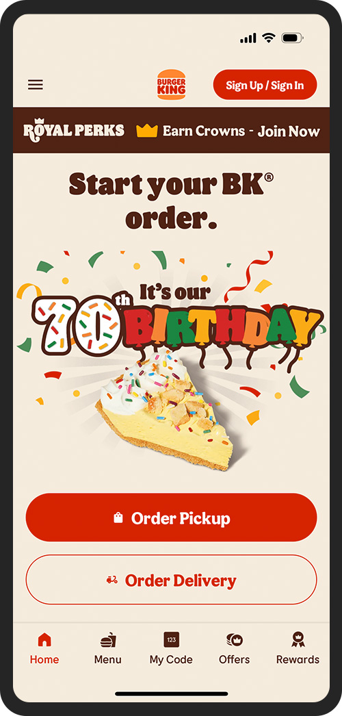
Unauthenticated


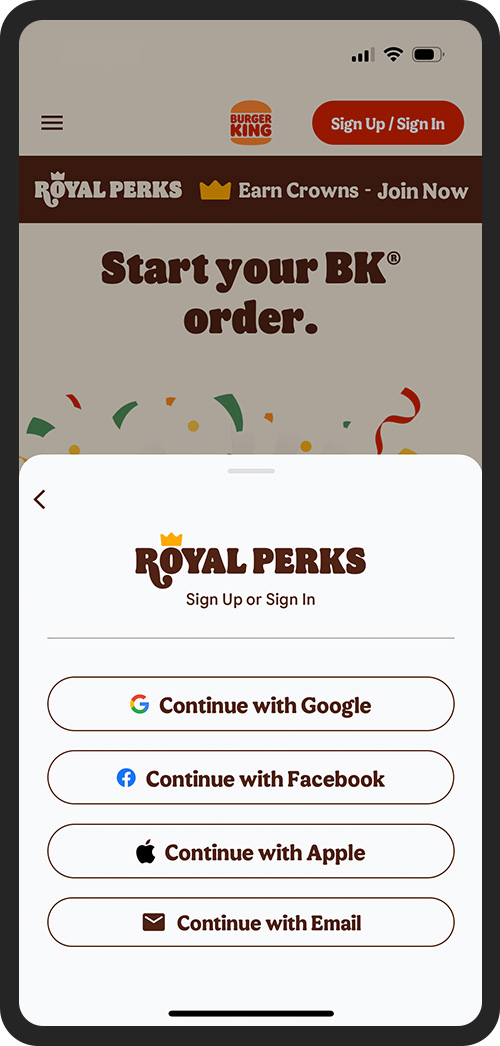
Sign In Drawer

Authenticated / Reorder
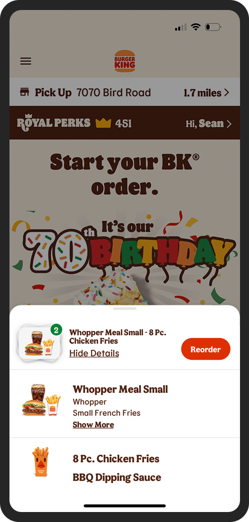
Reorder View Details

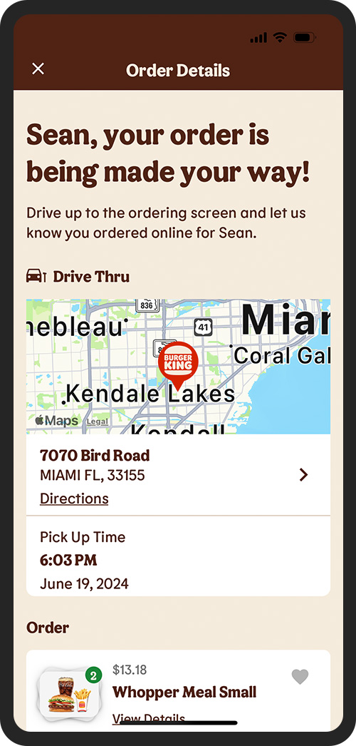
Order Details
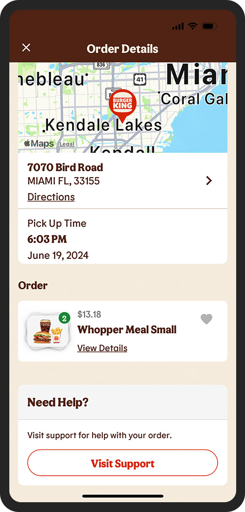
Order Details Scroll
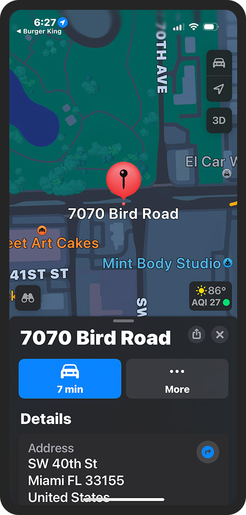
Directions Link
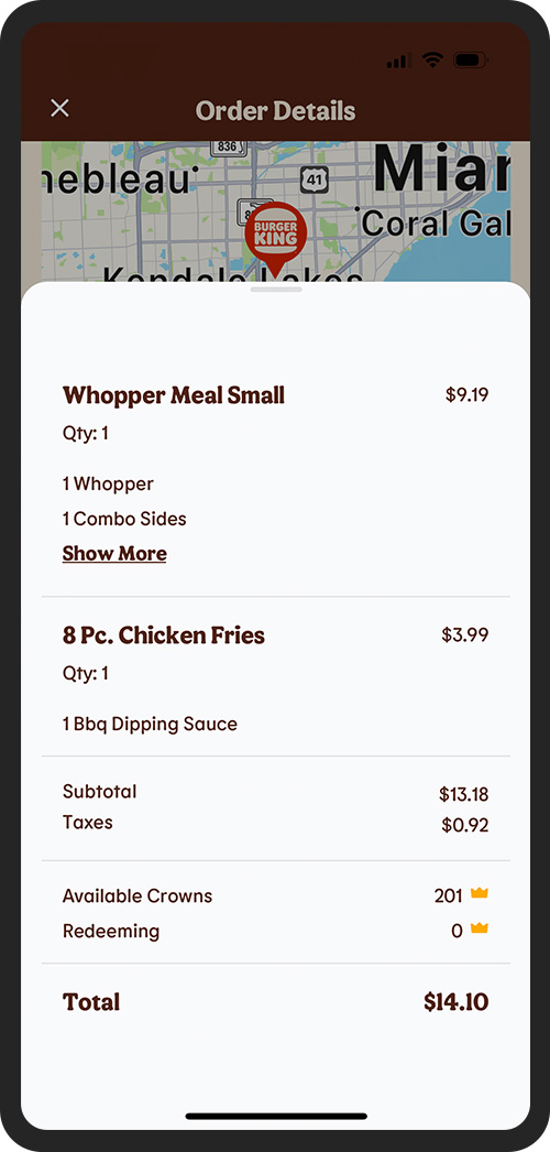
Order View Dertails Drawer
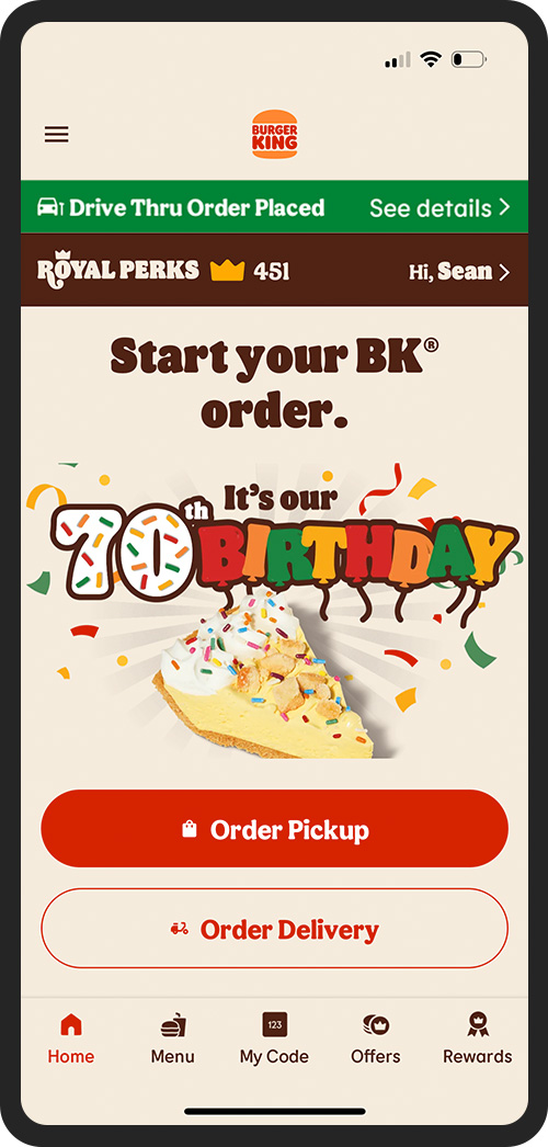
Order Placed Bar


Solution
To address these issues, I simplified the Home page to narrow the ordering funnel, making it easier for users to begin their orders. I also added a reordering component directly to the Home page for quick access to previous orders. Additionally, I redesigned the Order Confirmation page and introduced an order status bar that lives in the header of every page to provide clear and continuous updates on the order status.