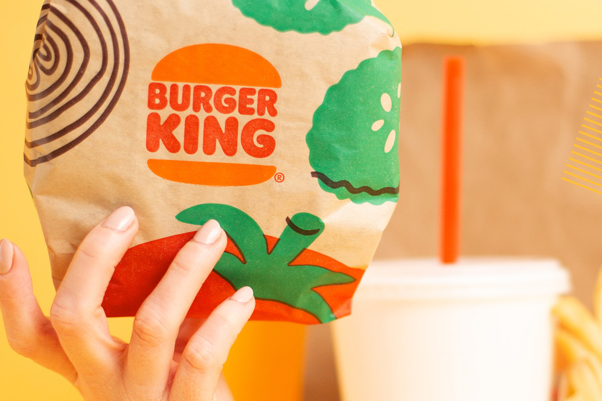

Burger King Rewards Page
The Rewards page is one of the most visited and utilized features by our customers on the Burger King app. It’s a key element that keeps users engaged and incentivizes repeat visits by offering various rewards based on their activity.
Role
Product Design ✦ User Research
Problem
Despite its popularity, the Rewards page was not user-friendly. The rewards were hidden behind closed tabs, making it difficult for users to view and navigate their options easily. This layout often led to frustration and a suboptimal user experience.

Solution
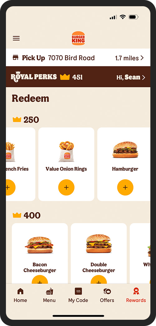
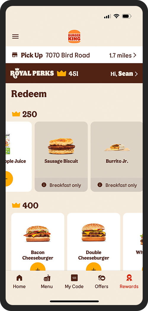
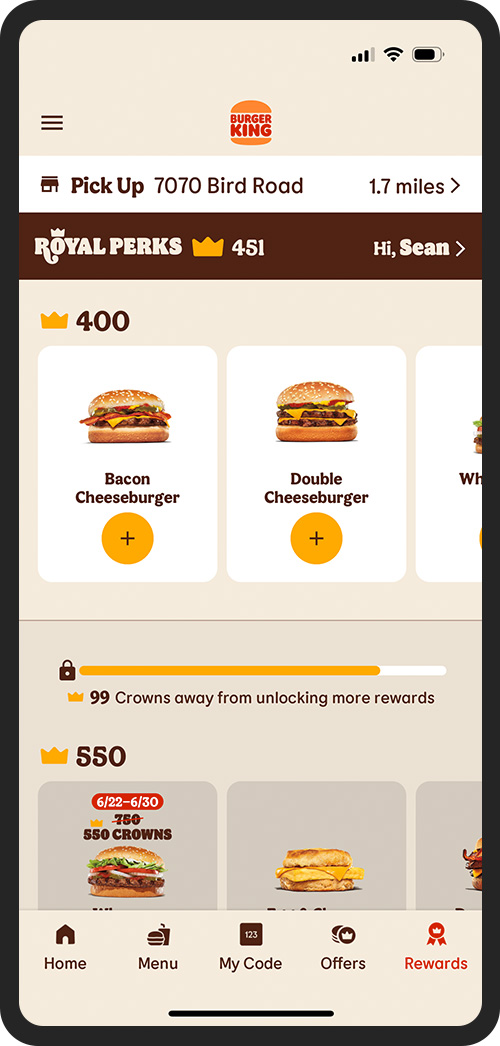
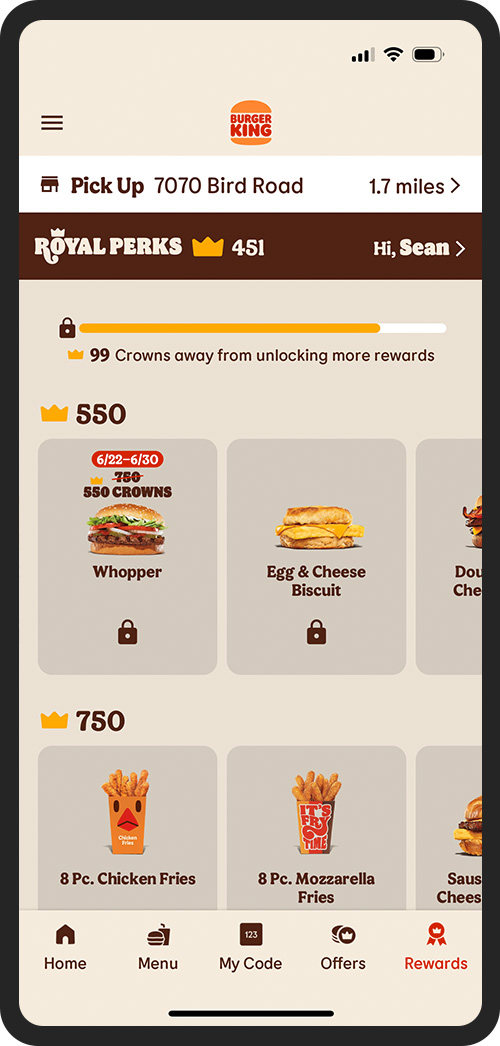
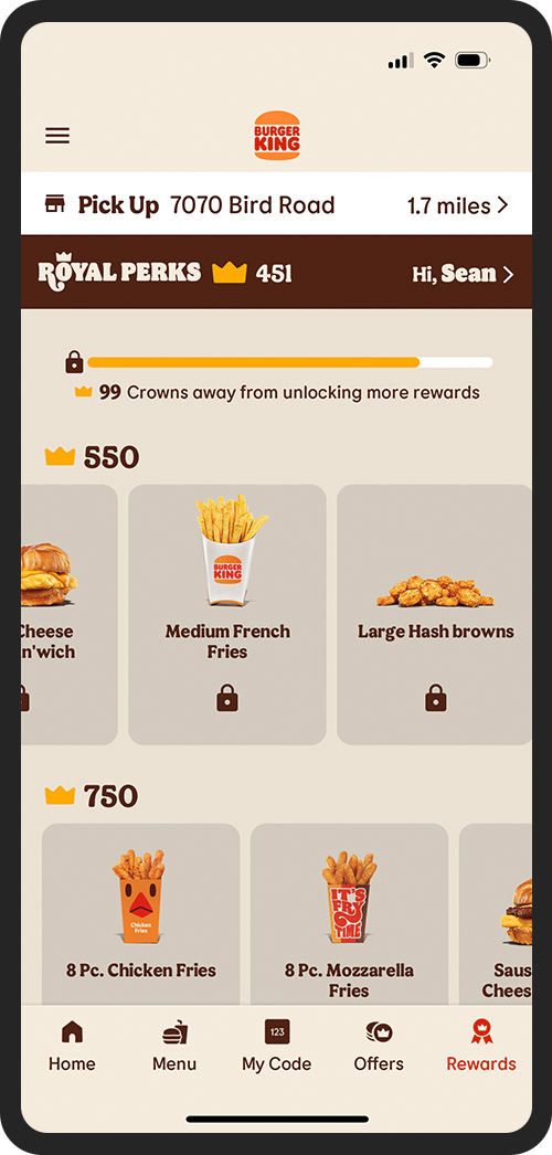
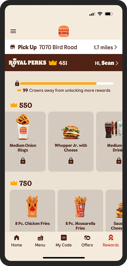
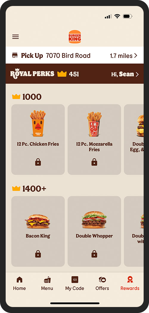
To address this issue, I redesigned the Rewards page to enhance its navigability. I also replaced the closed tabs with a more intuitive layout, incorporating horizontal scrolling within each reward level. This change allows users to easily swipe through available rewards, making the experience more seamless and enjoyable.